Kaj Lehmann
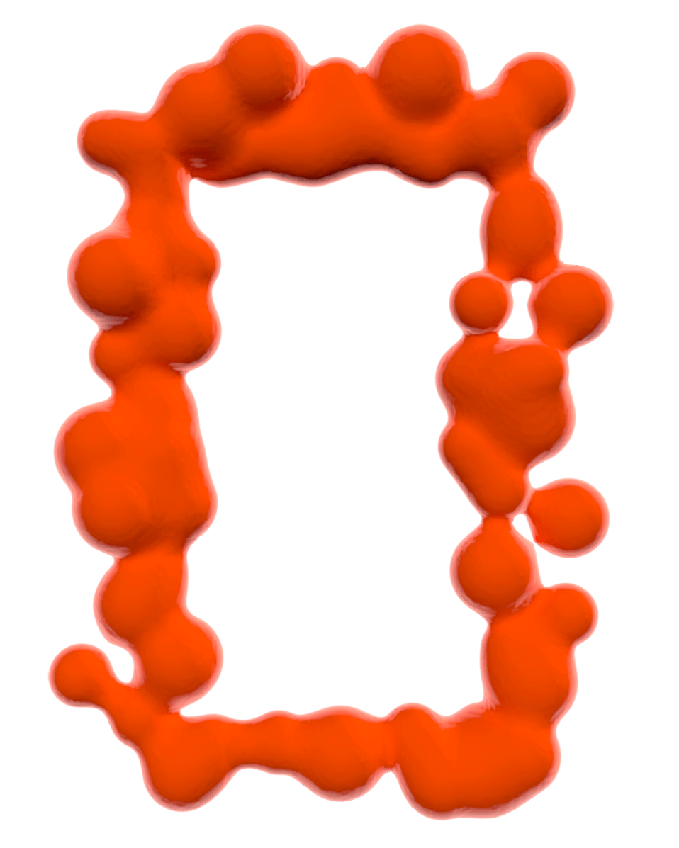
Graphic DesignSynt Typeface
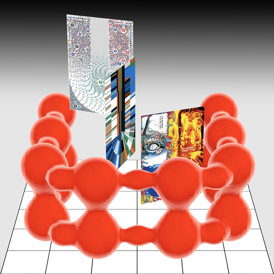
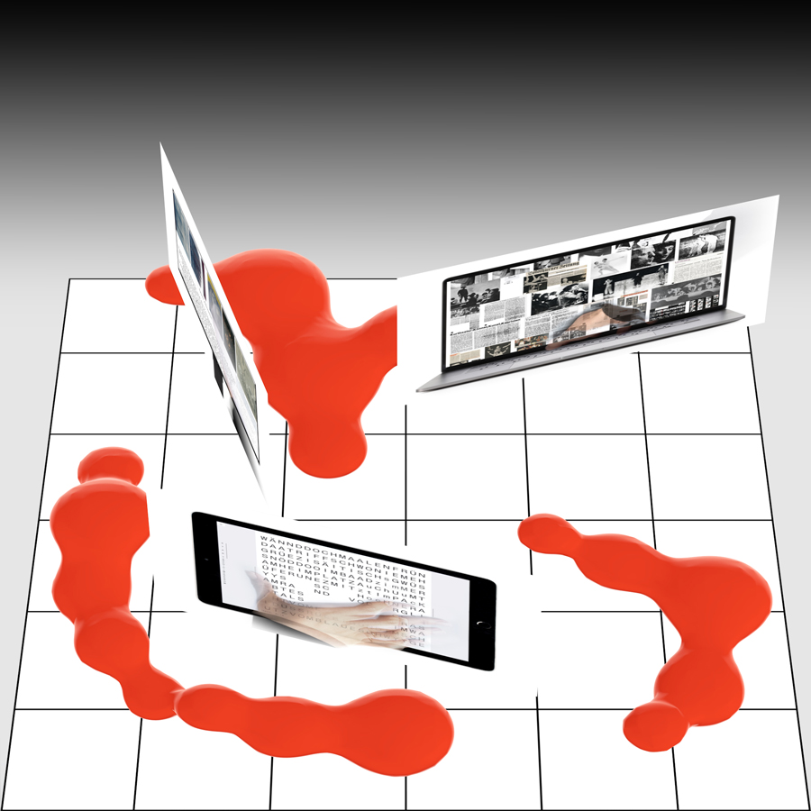
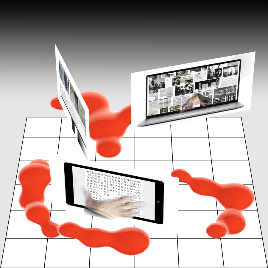
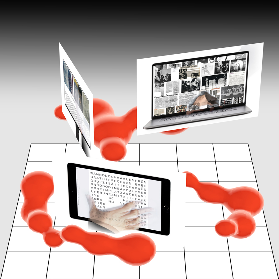
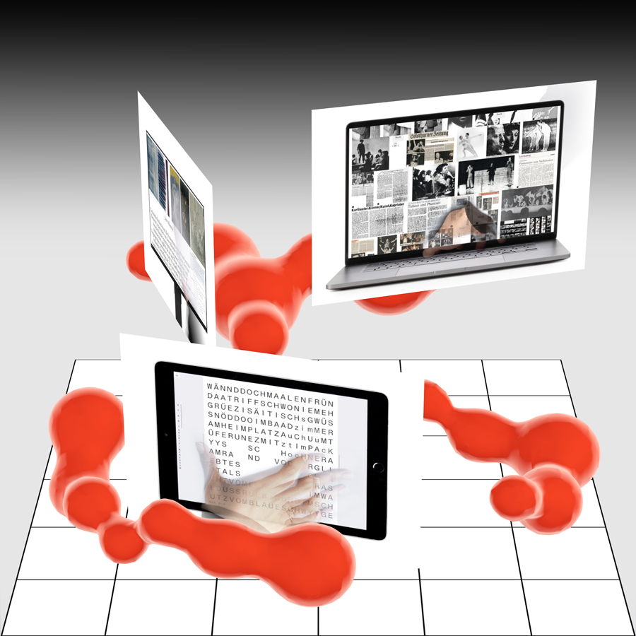
With his typeface Synt, Kaj Lehmann is researching late 19th-century modern typefaces — hot metal typefaces made for reading typography — and reimagining the genre in the context of today’s culture and technology.
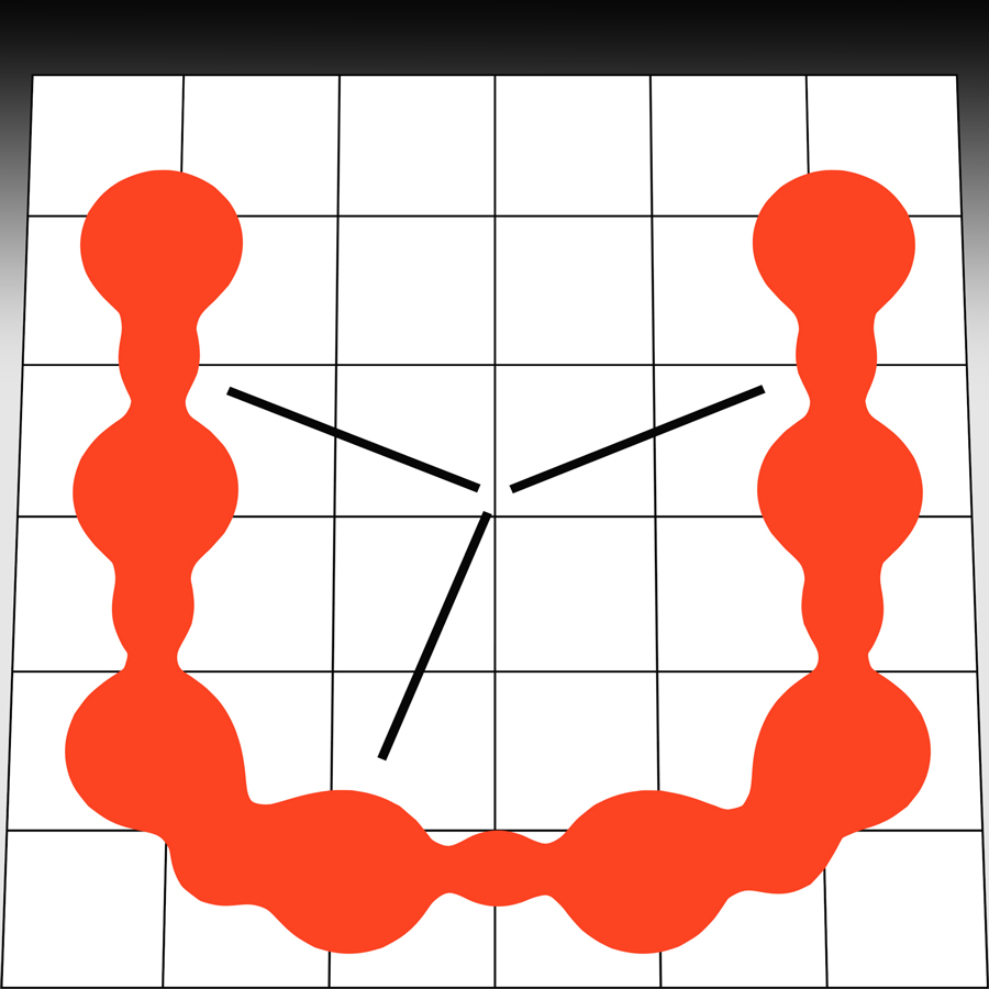
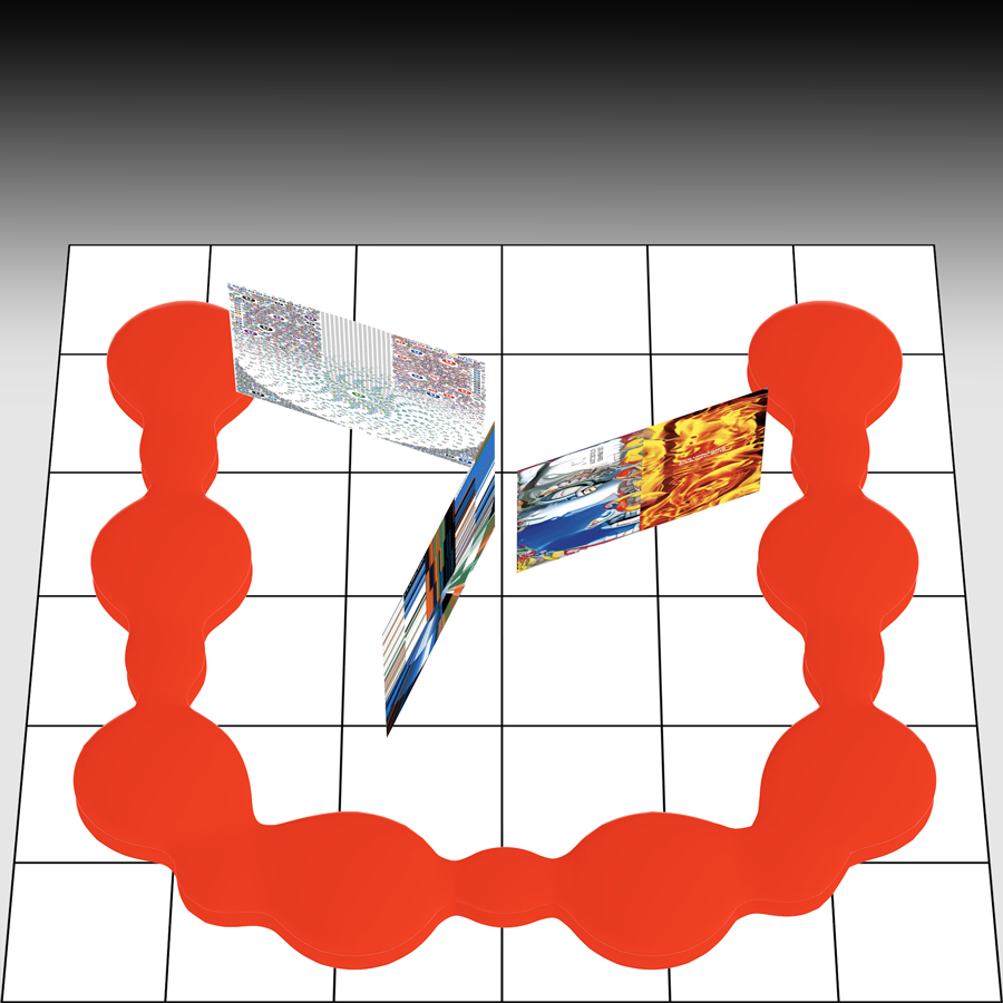
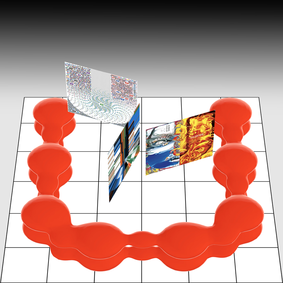
Kaj started the project in 2017 on the MATD (@ecal_matd) programme at ECAL, during which he conceived and designed the 17th issue of zweikommasieben Magazin (@zweikommasieben), a Swiss magazine focusing on contemporary music and sounds that he co-founded in 2011. Reflecting on the magazine’s topic, Synt is radically embracing rhythm and accentuation in typography: with vertical stems in letters always sitting at predefined positions — and therefore at equal intervals from each other — tension and dynamics automatically underlie any typographic layout created with Synt.
For the moment, Synt comes in three cuts: Upright, Slanted (which can be seamlessly animated from 0 degrees to a 32-degree angle), as well as a true-italic cut. Together with the team of the Swiss type foundry Dinamo (@abcdinamo), the typeface has been refined and mastered, and will soon be available to designers worldwide. Further styles (Bold, Monospace) are in planning and hopefully will follow in 2022/23.


Kaj Lehmann, born in 1988
www.kajlehmann.ch
www.daehlerlehmann.works
@kplehmann
©Kaj Lehmann and motion ©Josh Schaub
Behind the scene